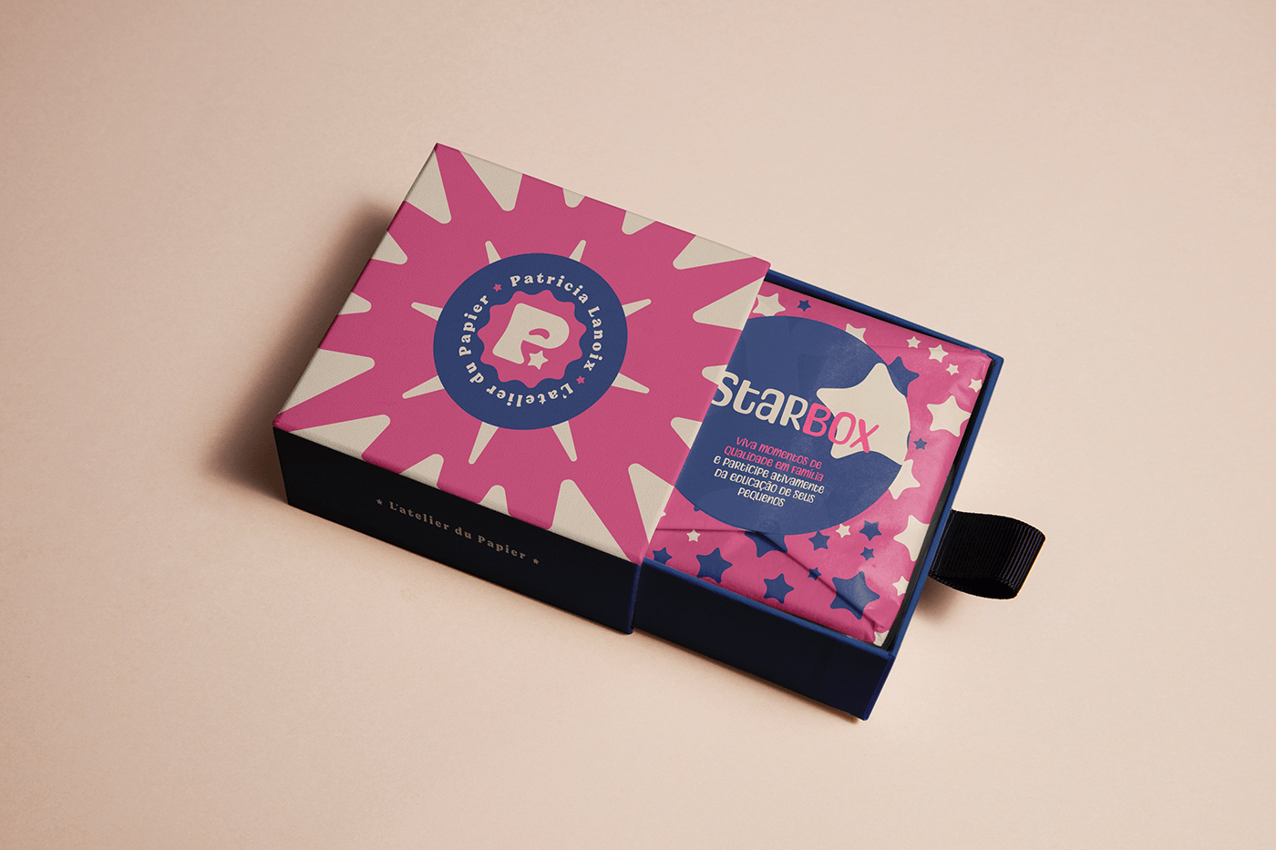
Sobre
Movida pela vontade de ajudar as famílias a tornarem a educação mais envolvente e divertida, Patricia Lanoix decidiu concentrar seus esforços nesse novo empreendimento. Com sua expertise em papelaria personalizada, ela se propôs a criar recursos educativos que estimulassem o aprendizado infantil, tornando-o acessível a todos, independentemente de sua classe social.
Nesse contexto, Patricia Lanoix almejava fortalecer e profissionalizar ainda mais sua marca. Com esse propósito, procurou-me para a criação de uma identidade visual que não apenas a representasse, mas também encapsulasse sua essência.
_
About
Driven by the desire to help families make education more engaging and fun, Patricia decided to focus her efforts on this new venture. With her expertise in personalized stationery, she set out to create educational resources that stimulate children's learning, making it accessible to everyone, regardless of their social class.
In this context, Patricia Lanoix aimed to further strengthen and professionalize her brand. With this purpose, she approached me to create a visual identity that not only represented her, but also encapsulated her essence.
Follow me @matheus.des
Client: Patricia Lanoix | Service: Visual Identity | Year: 2023 | Designer: Matheus Willian | Motion Designer: Alison Borba


Paleta de Cores
Para uma marca enérgica, repleta de amor, carisma e dedicação, era essencial escolher uma paleta que expressasse essas emoções e sensações.
O azul escuro simboliza o profissionalismo e a estabilidade de Patricia Lanoix. Ao combiná-lo com cores vibrantes e cheias de energia, conseguimos transmitir uma atmosfera acolhedora e calorosa.
O Rosa Vibrante, uma tonalidade profunda e cheia de vida, reflete a paixão e a energia dedicadas por Patricia Lanoix ao seu trabalho. Esta cor representa o brilho e o amor que ela irradia quando se trata de Papelaria educativa criativa. Sua natureza dinâmica e atraente tem o poder de causar um impacto visual marcante.
O Amarelo Pálido, por sua vez, traz equilíbrio, transmitindo calma e serenidade. Reforça a personalidade acolhedora da marca, sendo suave e delicado, emanando emoções positivas de maneira sutil.
_
Color Palette
For an energetic brand brimming with love, charisma, and dedication, it was crucial to select a color palette that conveyed these emotions and sensations.
Dark blue symbolizes Patricia Lanoix's professionalism and stability. When paired with vibrant and energetic colors, it allows us to convey a warm and welcoming atmosphere.
Vibrant Pink, a deep and lively shade, carries the passion and energy that Patricia Lanoix pours into her work. It represents the brightness and love she exudes when it comes to creative educational stationery. This color is dynamic and attention-grabbing, capable of creating a strong visual impact.
Pale Yellow, on the other hand, brings balance, transmitting calmness and serenity. Strengthening the brand's welcoming personality, it is soft and delicate, overflowing with positive emotions in a subtle manner.

Grid
Orgânico, fluído, irregular mas constante. Uma Grid construído sem limitações, harmonizada trabalhando proporções medidas no olho. Um jeito delicado de representar a educação de uma criança, onde cada uma segue seu próprio processo de aprendizado.
-
Grid
Organic, fluid, irregular but constant. A Grid built without limitations, harmonized by working proportions measured by eye. A delicate way to represent a child's education, where each child follows their own learning process.